RPR Unveils New Charts and Graphs in its Neighborhood Pages
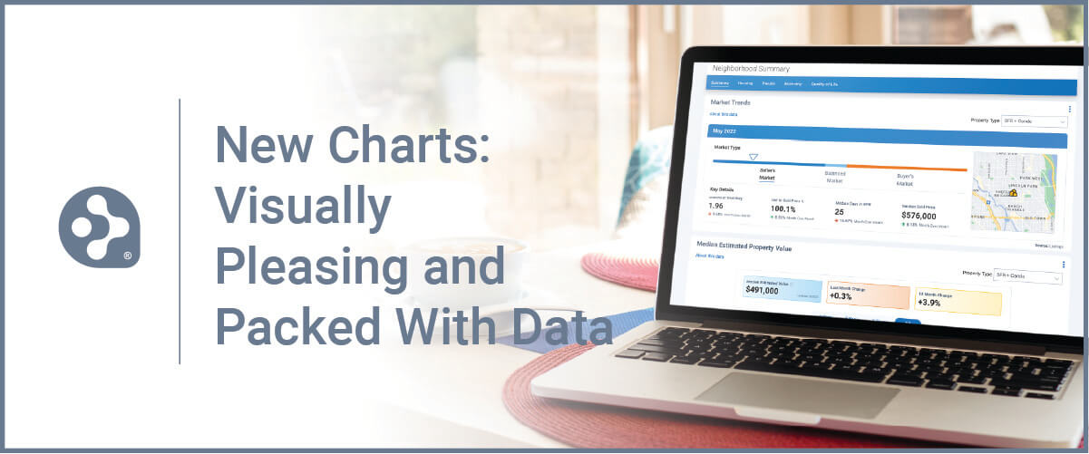
With our users in mind, RPR (Realtors Property Resource®) has made some really appealing changes to its Neighborhood pages.
In this latest product release, we’ve added new charts and refreshed some existing ones. It’s the same robust data you expect from RPR, but the presentation of it has been revamped and redesigned. It all adds up to a more eye-catching, interactive and responsive experience.
Here’s a quick look at all the new charts available in late June:
- Market Trends
- New Listings
- Active Listings
- New Pending Listings
- Pending Listings
- Sold Listings
- Months Supply of Inventory
- Sold Public Records
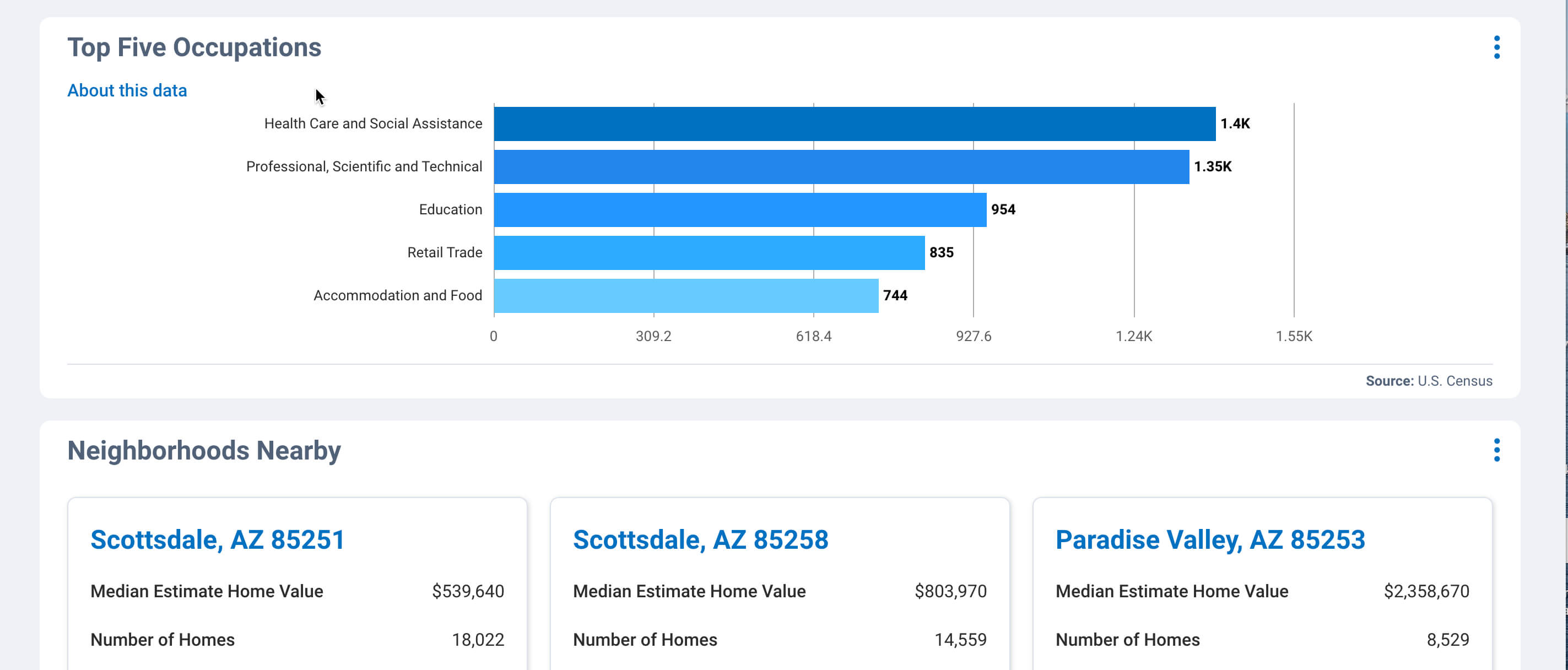
- Top Five Occupations
These new charts and graphs are perfect for research and staying on top of your local market trends, and for sharing with clients and prospects to position yourself as THE local market expert.
Here’s how to find the new charts in RPR…
RPR charts a new course in data visualization
To start, go to RPR and click the Research dropdown. Select Neighborhood Search.
Under Neighborhood Search, enter a neighborhood name, city, or zip code. Select Exact, Within, or Nearby from the dropdown. Now hit the magnifying glass icon to search. Once you’ve selected the neighborhood you want to view, you’ll be redirected to the Neighborhood Details page.
The Neighborhood Details is broken up into five areas: Summary, Housing, People, Economy and Quality of Life. Let’s look at the summary overview first…
To summarize…
From the summary tab of the Neighborhood Details page, the first thing you’ll see is the new “Market Trends” card. This view showcases key metrics for any neighborhood. It’s basically a quick, at a glance snapshot of the local market.
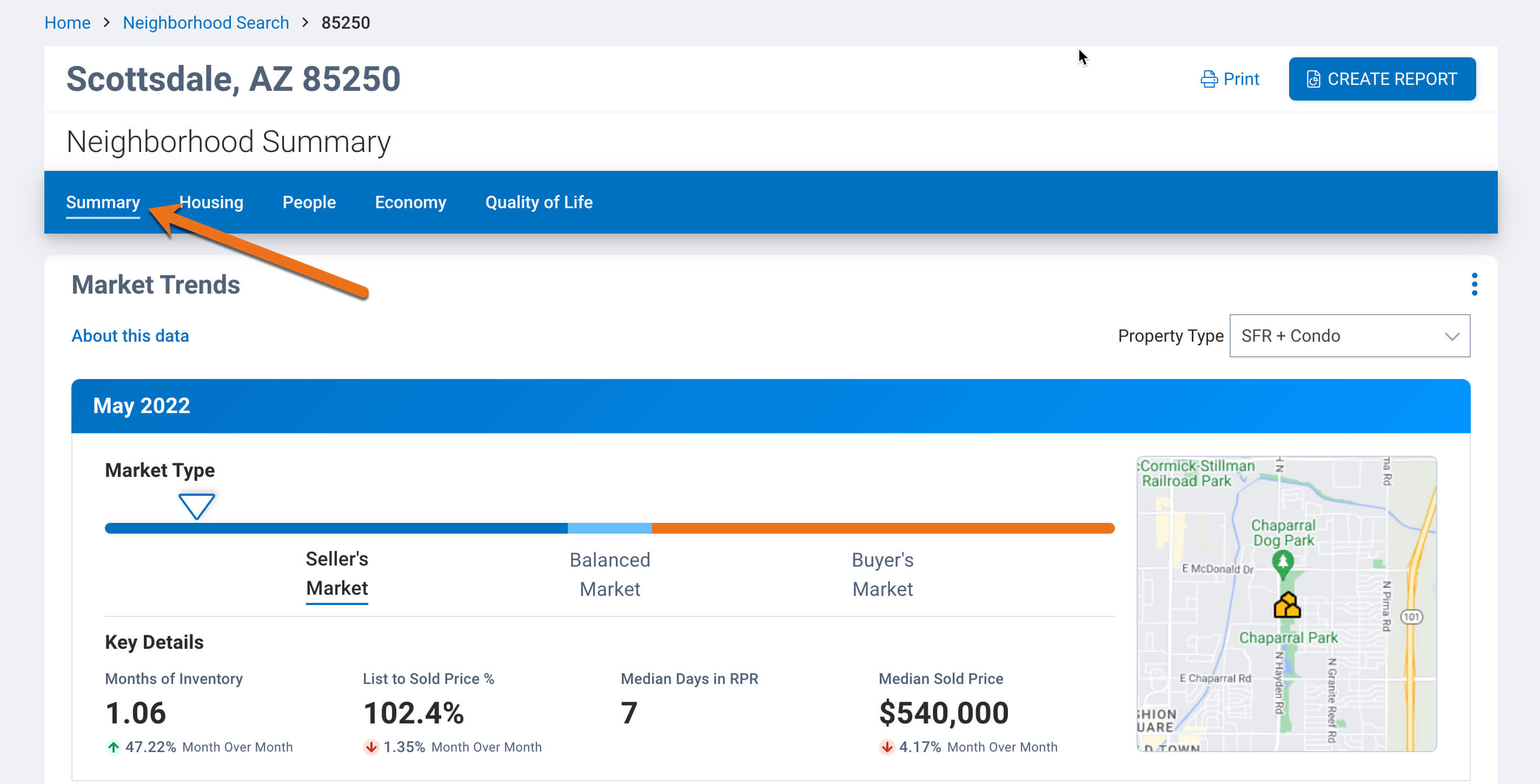
The first area is full of important and relevant information about your chosen housing market. The type of market (seller’s, buyer’s or balanced) is represented on a sliding scale. To get more details on how this is measured, click the “About this data” link, it’s in blue right under the “Market Trends” title. It’s an industry standard that is determined by months of inventory.
Then you’ll see the “Key Details” which include the Months of Inventory, the List to Sold Price percentage, the Median days in RPR, and finally, the Median Sold Price. This provides four key metrics about how long homes have been on the market, whether they’re going above or below asking price and on average, how much they’re selling for. Green (up) and red (down) arrows below these stats also give a month over month up or down percentage rate, too.
Median Estimated Home Values
In the next section, you’ll see a graph for the Median Estimated Home Values. This shows monthly and yearly changes in property values, as well as the ability to compare your area to values within cities, counties and the state.
Also, be sure to notice the “Property Type” pulldown menu, where you can specify which types of properties you want to focus on. The default is SFR + Condo, which is Single Family Residence and Condo properties (this property type also includes townhouses and apartments), but you can choose many other options. You can also choose to change the property type for that particular chart, or all of them.
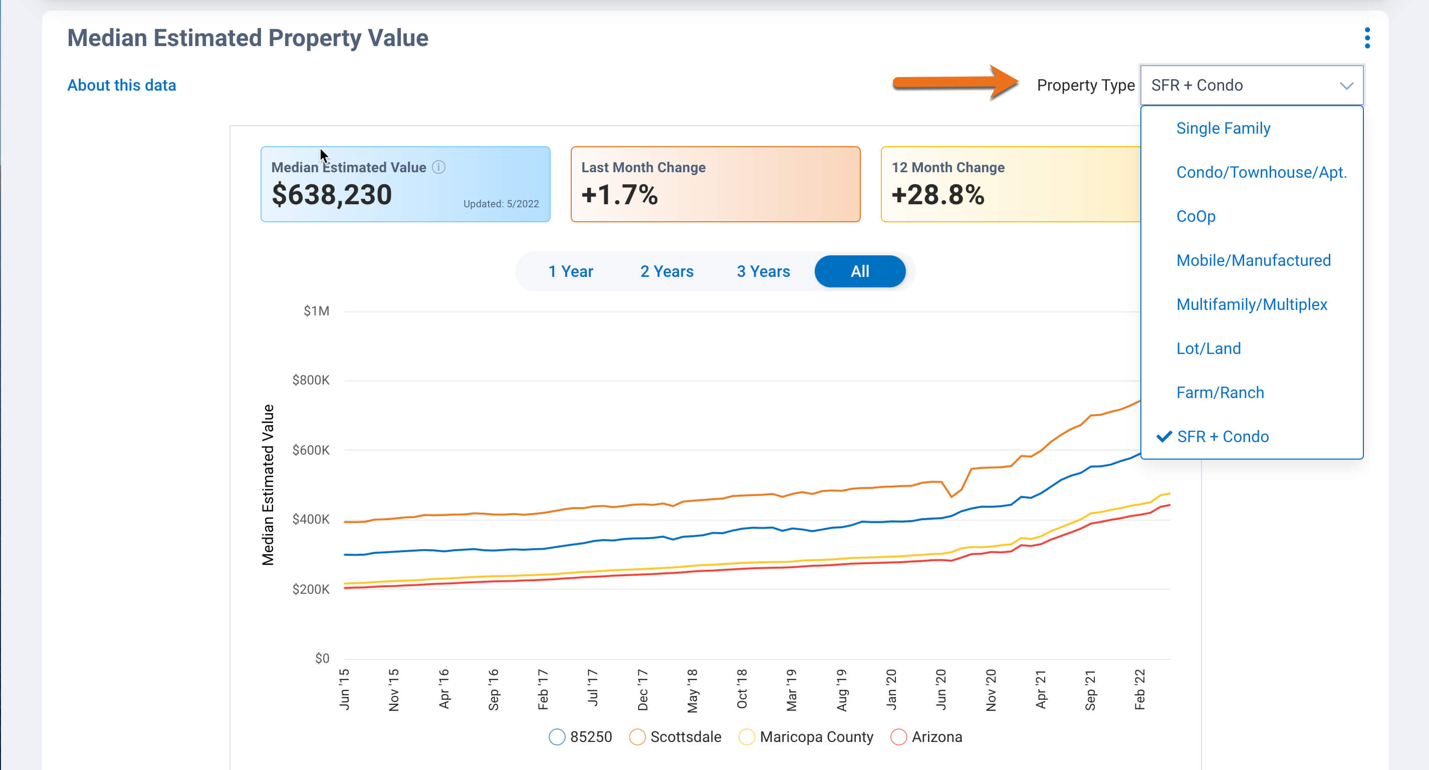
Again, if you’re curious as to how these metrics are determined, just select About this data to see how the market types are defined, as well as the source and update frequency.
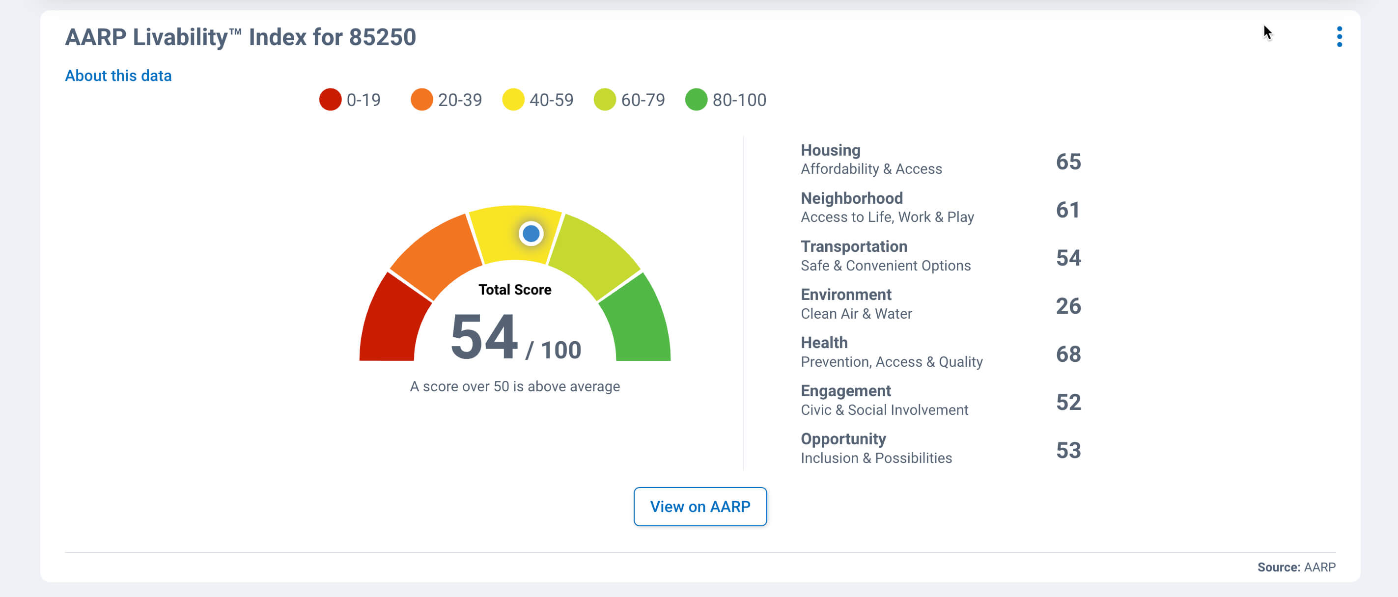
Rounding out the Summary page is the AARP Livability Index, and the Top Five Occupations in the area and nearby neighborhoods. Both provide population, community and demographic stats and information on your chosen neighborhood.
Housing Facts and Stats
Now let’s visit the “Housing” tab to take a deep dive into the housing metrics of the neighborhood. The top chart highlights the neighborhood’s housing characteristics compared to the county, state and nation, including comparisons for home ownership, rent, and information about permits and buildings.
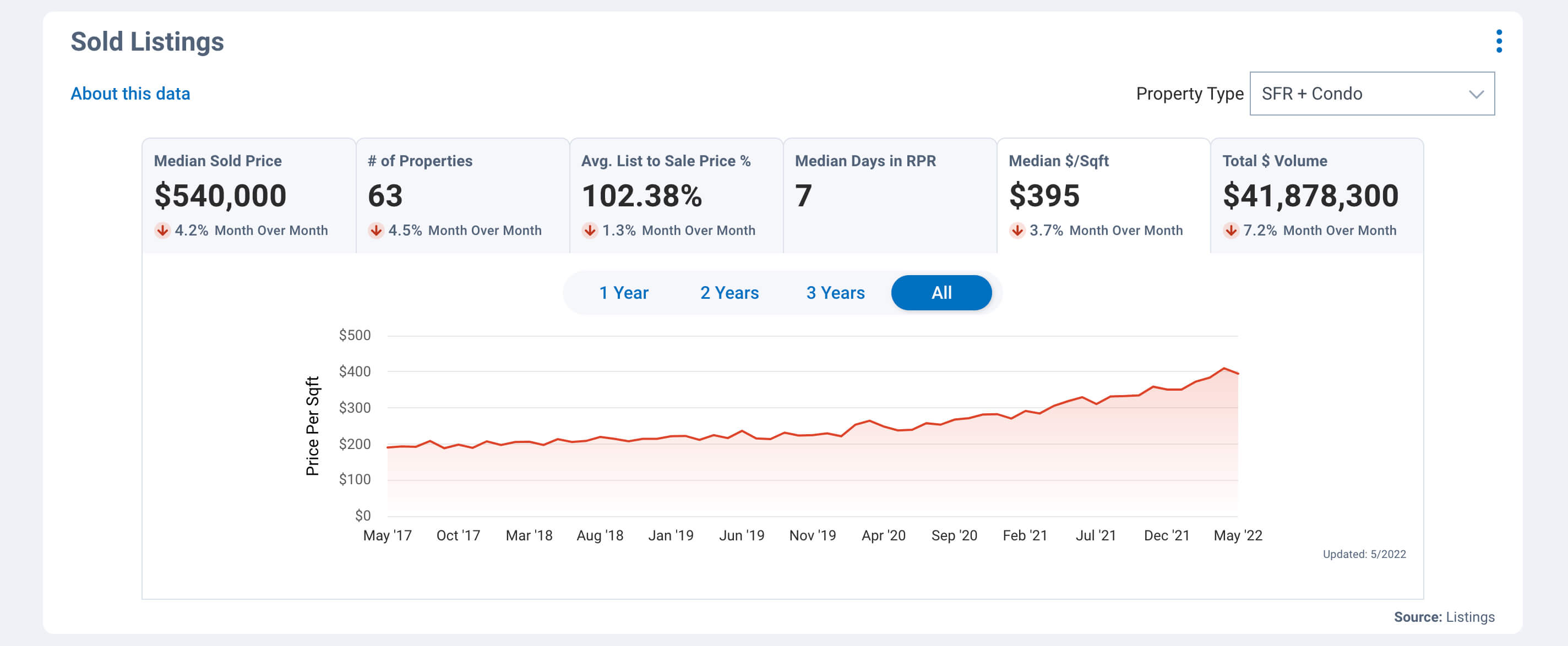
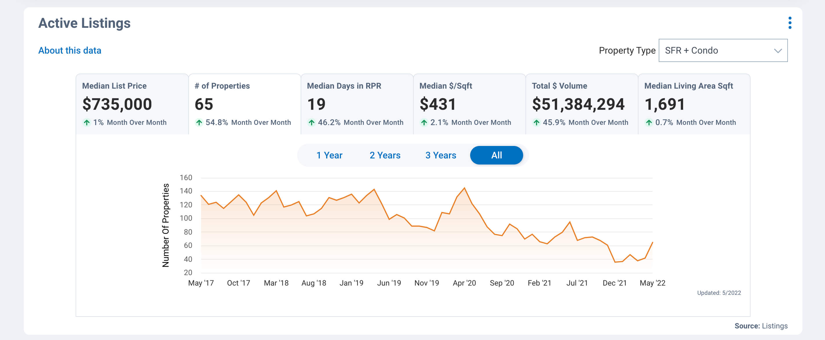
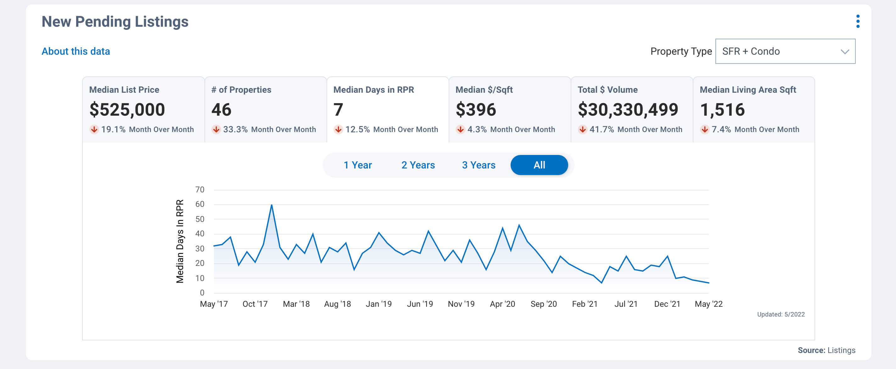
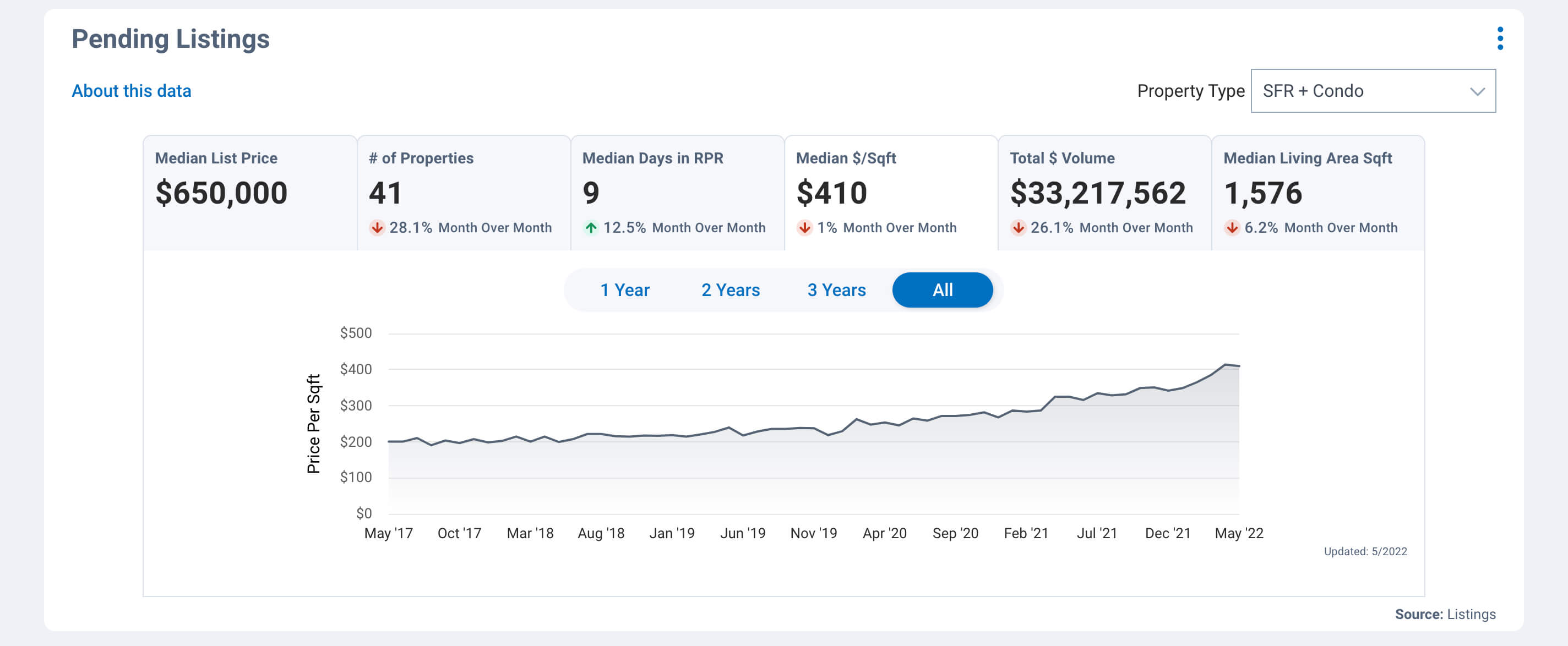
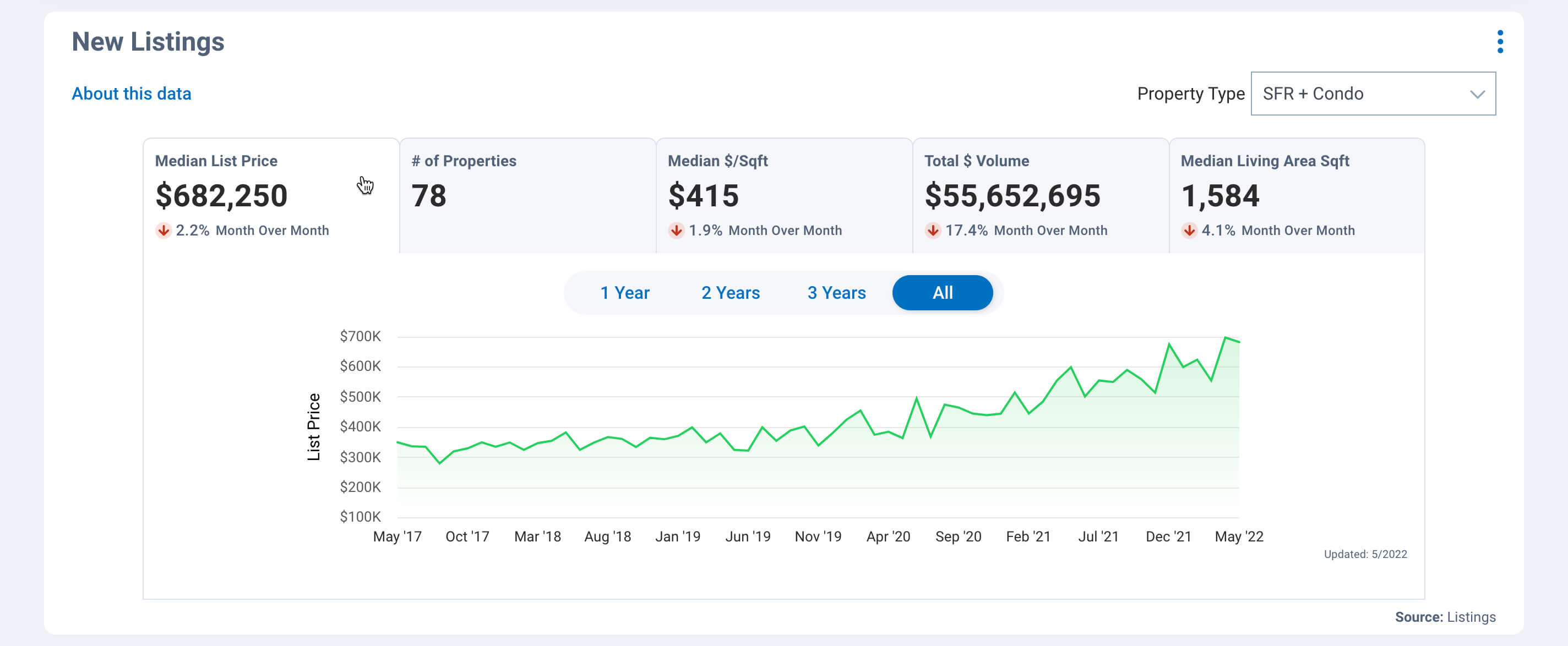
Next up are charts for listings, including New Listings, Active Listings, New Pending Listings, Pending Listings and Sold. Listings. These charts provide an in-depth look at several housing market statistics over a period of time.
- New Listings: anything listed within that month
- Active Listings: still active at end of month regardless of when it was listed
- New Pending Listings: what went into pending status that month
- Pending Listings: what was still in pending status as of the last day of the month
- Sold Listings: what was sold the previous month, but most importantly, how much over or under the list price is going for in the Avg. List to Sales Price % section
Rounding out the Housing tab is Months Supply of Inventory, Sold Public Records and Sold Home Stats. In these sections you can select the property type you want to view. Choose whether to change just the chart you are viewing or all the charts on the page. Again, the “About this data” link will give you full descriptions of how these stats are configured.
The big takeaway here is being able to track and monitor the volume and the details of housing inventory. Another key metric is being able to see whether homes are selling for over or below the asking price.
People, Economy and Quality of Life
Pure housing statistics and data are essential in identifying and communicating housing market trends. However, you can dig even deeper into what makes up a neighborhood by checking out these other qualitative types of categories.
The “People” tab to get to the heart of who lives in the neighborhood. Find a side-by-side comparison chart that measures population counts, densities and changes; median age, gender, and education levels. See the population of children and adults by age group, households with children and the income brackets making up the area, as well as occupational categories and voting patterns.
The “Economy” tab displays data such as job growth, unemployment rate and cost of living.
Lastly, the “Quality of Life” tab displays data, such as weather and water quality, commute times, transportation options, monthly temperatures, the AARP Livability index, and walkability scores. This tab is particularly helpful when working with relocations.
RPR’s neighborhood data can be used to evaluate a target neighborhood and search for the right area for your clients. Get a feel for the trends in a particular neighborhood by examining the data and charts presented.
How to print and save RPR charts
Just a note: the new chart metrics will not display on RPR reports at this time. To print a specific chart or set of charts, use the Print button, which resides in the upper right navigation area. If there’s a chart you don’t want to include, simply collapse that chart and it will not show.
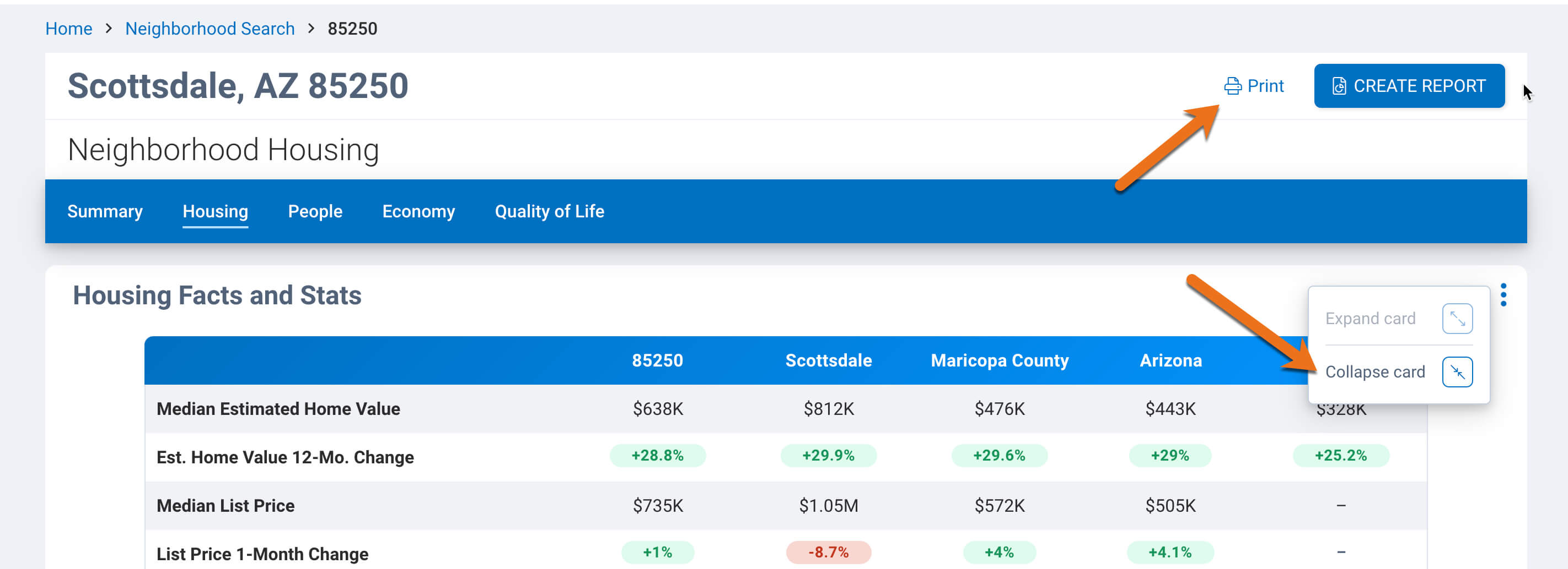
To include these new charts in an RPR Report, click the “Print” button, and then under the “Destination” pull down menu, you can choose to save the file as a .pdf. Save the file (chart) and then you can attach it to other RPR reports from the Reports generation page. This is done through the Manage Custom Pages Link, which you can read about here: Learn more about Custom Pages.
Share charts to your sphere
Number crunchers and data nerds are sure to love these new charts! Be sure to grab them and share them with your sphere of influence.
And if your clients prefer less information over more details, just send along the easy to digest “Market Trends” chart and walk them through it. You’ll look like a housing data pro and be sure to impress.
Share This Story, Choose Your Platform!
2 Comments
Leave A Comment
TOPICS
AUDIENCE
CATEGORIES
TUTORIALS & GUIDES
SUCCESS STORIES
PROSPECTING
THE PODCAST




Love this!! Definitely going to use and the charts are great for those who love visual data.
I like the new format!